
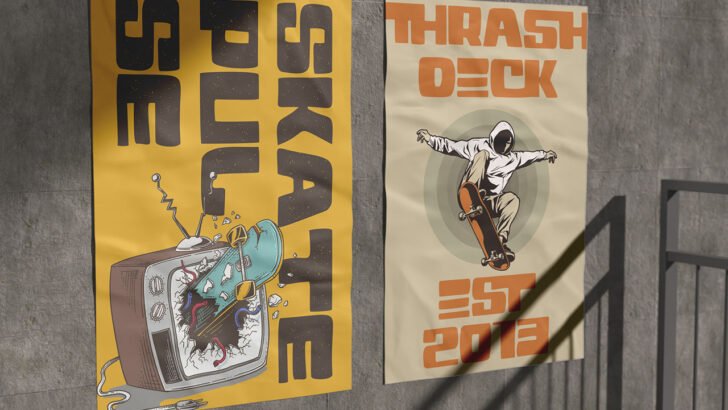
Creative typography can completely transform the way a design looks and feels. The right font can make a poster more attention-grabbing, give a brand a distinctive personality, or make a social media post feel more polished and memorable. Typography is not simply about choosing a typeface; it is about finding the right visual voice for your message.
For designers, finding the right font can sometimes be challenging. There are thousands of typefaces available, each with its own personality, proportions, and visual character. A bold display font may work beautifully for a poster, while an elegant script might be a better choice for a wedding brand.
In this guide, we’ll explore 10 creative typography ideas using different font styles for posters, branding, and social media. Whether you’re working on a client project or experimenting with your own designs, these ideas can help you find a type style that fits your creative direction.
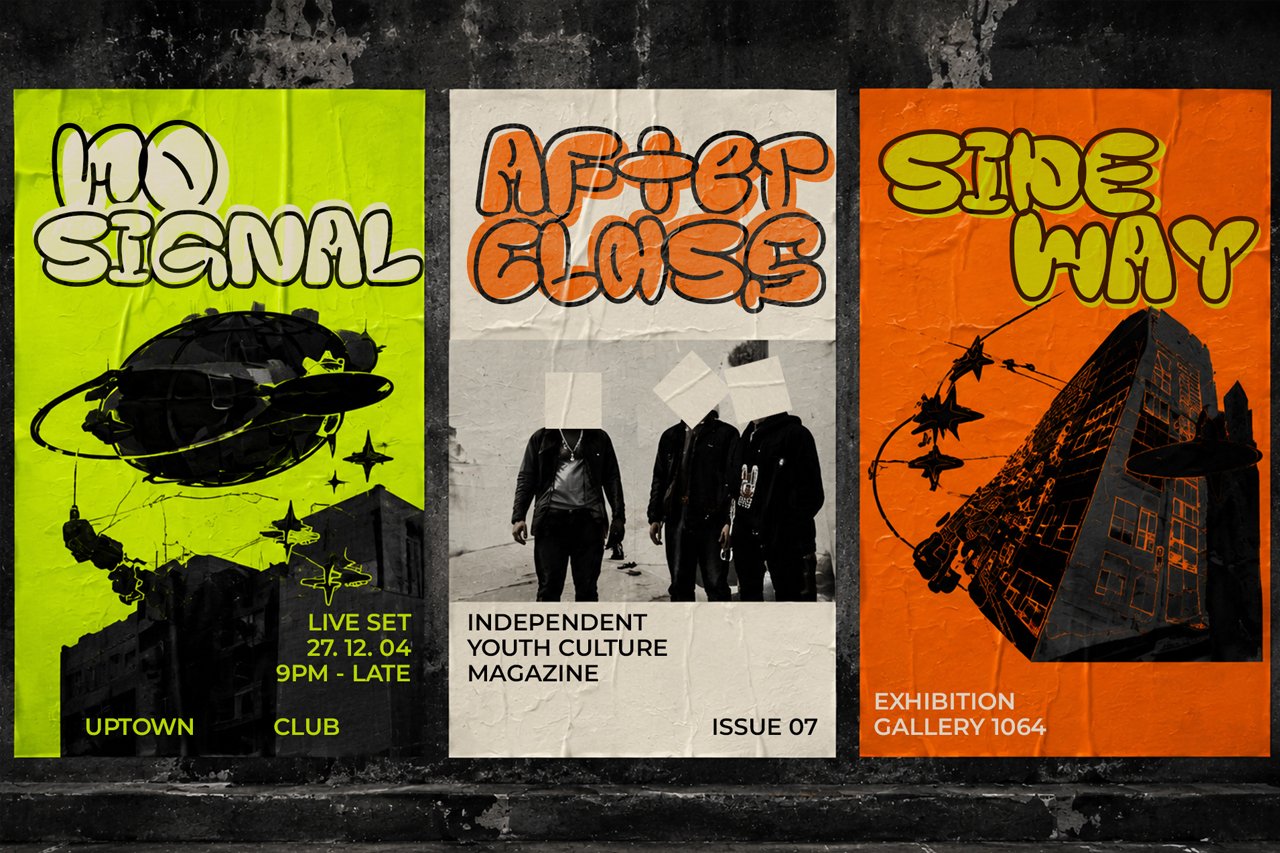
1. Creative Typography Ideas with Bold Display Fonts
When you need your design to make an immediate impression, bold display fonts are a great place to start. These fonts usually have strong shapes, unusual proportions, or distinctive letterforms that naturally attract attention.
Bold display fonts are particularly useful for posters, event promotions, advertisements, album artwork, and large headlines. Because they are designed to be noticed, they can turn a simple phrase into a major visual element.
Try using a bold font for your main headline while keeping the supporting information simple. A clean sans serif can provide the contrast needed to make the headline stand out without making the entire composition feel overwhelming.
For an effective poster, experiment with:
- Large headlines
- Uppercase lettering
- Short and memorable phrases
- Generous spacing
- Contrasting font weights
The goal is to make the typography part of the artwork rather than treating it as an afterthought.
2. Creative Typography with Elegant Script Fonts
Script fonts can give a design an elegant, personal, and sophisticated character. Their flowing letterforms make them especially popular for wedding stationery, beauty brands, fashion projects, photography, invitations, and luxury products.
One of the biggest advantages of script fonts is their ability to create a personal feeling. A carefully selected script can make a brand name feel more distinctive and memorable.
However, readability should always come first. Some highly decorative scripts look beautiful at large sizes but become difficult to read when reduced.
A good approach is to use a script font for a logo, headline, or short phrase and pair it with a simple sans serif for supporting text.
If you’re searching for fonts for your next branding project, you can explore the JadaType font collection for different script, display, serif, and sans serif styles.
3. Handwritten Fonts for Friendly Social Media Designs
Social media design doesn’t always need to look perfectly polished. Sometimes, a little imperfection can make content feel more approachable.
This is where handwritten fonts can be useful.
Handwritten typefaces can add a casual and personal touch to Instagram graphics, lifestyle content, food posts, creative business promotions, and personal branding.
They are particularly effective when used for short messages, quotes, titles, or decorative elements.
For example, you might combine a handwritten headline with a clean sans serif for the rest of the content. This creates a visual contrast while maintaining readability.
Avoid using handwritten fonts for long paragraphs. Their irregular shapes can make large amounts of text tiring to read.
Instead, give the handwritten style a small but noticeable role in your composition.
4. Modern Sans Serif Fonts for Minimal Branding
Not every successful typography design needs a highly decorative font.
Modern sans serif typefaces are a great example of how simplicity can create a strong visual identity. Their clean shapes make them suitable for logos, websites, packaging, presentations, and social media branding.
One of the best things about sans serif fonts is their flexibility. You can create contrast using different weights instead of switching between multiple typefaces.
For example:
Bold — Main headline
Medium — Subheading
Regular — Supporting information
This simple hierarchy can make a brand identity feel organized and professional.
For minimalist branding, pay close attention to spacing. Letter spacing, line height, and margins can have just as much impact as the font itself.
Sometimes, giving a simple typeface more breathing room is all you need to create a sophisticated result.
5. Retro Fonts for Nostalgic Creative Typography
Retro-inspired typography has a distinctive ability to create an emotional connection. A vintage font can immediately remind people of a particular era, aesthetic, or visual culture.
Retro fonts can work especially well for restaurant branding, packaging, posters, merchandise, music artwork, and social media campaigns.
The style you choose will determine the mood. Some retro fonts feel elegant and classic, while others are colorful, playful, or energetic.
You can strengthen the vintage atmosphere by combining the font with suitable colors, textures, illustrations, or photography.
However, don’t let the decorative elements compete with the message. A good retro design still needs a clear hierarchy so readers know what to look at first.
6. Serif Fonts for Premium and Editorial Designs
Serif fonts are another versatile option for creative typography. Their small decorative strokes can give text a classic, established, and refined appearance.
Traditional serif fonts can work well for editorial layouts, magazines, books, and corporate identities. Meanwhile, contemporary serif fonts can feel much more experimental.
Modern serif typefaces often feature dramatic curves, high contrast, unusual proportions, or oversized details. These characteristics make them useful for fashion brands, luxury packaging, beauty campaigns, and sophisticated social media graphics.
For an elegant composition, try using a large serif headline with plenty of whitespace.
You don’t always need additional decorative elements. A carefully selected typeface combined with a strong layout can create a powerful result on its own.
7. Brush Fonts for Energetic Social Media Content
Brush fonts bring a more expressive and handmade quality to typography. Their uneven strokes can make digital designs feel more dynamic and spontaneous.
They are often suitable for posters, music graphics, travel content, food branding, apparel designs, and social media campaigns.
Brush fonts work particularly well with short, energetic phrases. Rather than using them for every piece of text, allow the brush style to become an accent.
For example, a campaign could use a brush font for its main slogan while using a clean sans serif for the date, location, or additional information.
If you’re interested in this particular style, Elometha Brush Script Font is an example of a brush-style typeface that can be used for posters, social media graphics, advertising, and other creative projects.
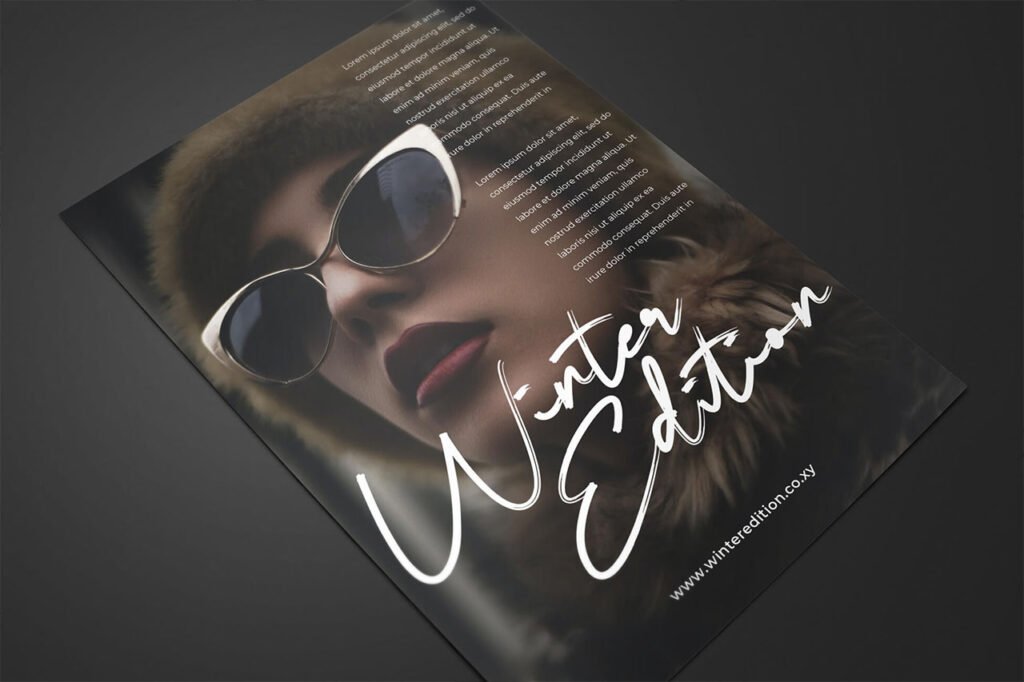
8. Playful Fonts for Creative Brands
Some brands simply need typography with more personality.
Playful fonts can be a good fit for children’s products, entertainment brands, food businesses, events, stickers, packaging, and social media campaigns.
Look for typefaces with rounded corners, unusual shapes, exaggerated proportions, or quirky letterforms. These small details can make a design feel more energetic without requiring complicated graphics.
The important thing is to choose a playful font that matches the personality of the project.
A children’s brand, for example, may benefit from a friendly rounded typeface, while a creative clothing label might need something more experimental.
The font should feel like part of the brand rather than a random decorative choice.
9. Blackletter Fonts for a Strong Visual Identity
Blackletter typography has a distinctive appearance that can immediately create a strong visual identity.
Although it has historical roots, modern designers continue to use blackletter-inspired fonts for streetwear, music artwork, posters, merchandise, fashion projects, and alternative brands.
Because blackletter fonts are highly decorative, they usually work best when used selectively.
A short brand name or headline can look striking in blackletter, while supporting information can be presented using a simpler typeface.
This combination creates contrast and prevents the design from becoming difficult to read.
If your project has a bold, unconventional, or rebellious personality, blackletter can be an interesting direction to explore.
10. Creative Typography Through Font Pairing
Sometimes, the best typography solution isn’t a single font. It’s a combination of two typefaces that complement each other.
Font pairing allows you to give different pieces of information different visual roles.
Some combinations to experiment with include:
Display + Sans Serif
Great for posters, advertisements, and event graphics.
Script + Sans Serif
Suitable for weddings, beauty brands, photography, and lifestyle projects.
Serif + Sans Serif
A versatile combination for editorial and premium branding.
Handwritten + Sans Serif
Useful for social media, personal brands, and creative businesses.
The trick is to create enough contrast without making the fonts feel unrelated.
When pairing fonts, consider differences in weight, width, height, and overall personality. You can also experiment with size and spacing to establish a clear hierarchy.
For additional guidance, Adobe’s guide to font pairing offers useful principles for combining typefaces effectively.
How to Choose the Right Creative Typography
Having plenty of font choices can make the design process exciting, but it can also make choosing a typeface more difficult.
Before downloading or purchasing a font, think about the purpose of your project.
Consider the Purpose of Your Design
A promotional poster has different requirements from a logo or Instagram post.
Ask yourself what the typography needs to accomplish. Does it need to grab attention from a distance? Communicate elegance? Make a brand feel friendly? Or simply provide easy-to-read information?
The answer can help narrow down your font choices.
Think About the Brand Personality
Typography should support the personality of the project.
Words such as modern, playful, elegant, bold, vintage, professional, handmade, or minimal can help you identify the right design direction.
Always Test Readability
A font can look fantastic in a specimen preview but behave differently in your actual design.
Test it with the real words you plan to use. Check how it looks at different sizes and alongside other fonts.
Pay particular attention to small text, especially when designing content that will primarily be viewed on mobile devices.
Final Thoughts on Creative Typography
The most effective creative typography doesn’t necessarily come from using the most unusual font available. Great typography comes from choosing a typeface that supports the message, personality, and purpose of the design.
Bold display fonts can make posters more impactful, while script fonts can bring elegance to branding. Handwritten and brush fonts can make social media content feel more personal, while serif and sans serif fonts provide a wide range of professional design possibilities.
Don’t be afraid to experiment. Try different font sizes, weights, spacing, and combinations until you find a balance that feels right.
If you’re ready to explore new typefaces for your next project, browse the JadaType font collection and discover fonts that can bring your next typography project to life.