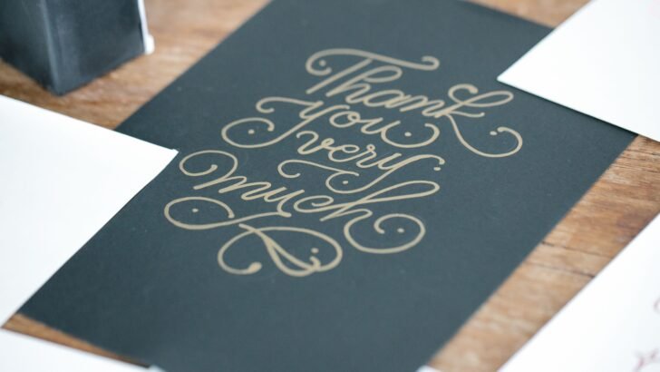
Wedding invitations are one of the first things guests see before your big day. The right typography can instantly set the mood and make your invitation feel elegant, romantic, modern, or timeless. That is why choosing the right wedding fonts for invitations is an important part of the design process.
From flowing calligraphy to refined script styles, there are many fonts that can give your wedding stationery a personal touch. However, not every decorative font works well for an invitation. You need a style that looks beautiful while keeping important details easy to read.
In this guide, we have selected 8 wedding fonts for invitations that work especially well for names, wedding titles, dates, and other decorative elements.
What Makes a Good Wedding Font for Invitations?
Before choosing a font, think about the overall mood of your wedding. A formal celebration may need an elegant calligraphy font, while a garden wedding could work better with a softer handwritten style.
The best wedding fonts for invitations usually have three things in common: personality, elegance, and readability.
A decorative script can work beautifully for the couple’s names or the main heading. Meanwhile, a simpler serif or sans serif font can be used for the address, date, venue, and other details.
This combination creates a clear visual hierarchy. Adobe also recommends considering hierarchy, readability, contrast, and balance when combining typefaces.
Now, let’s look at eight fonts that can give your wedding invitation a beautiful finishing touch.
1. Ballet
Ballet is an elegant script style with a graceful and romantic appearance. Its flowing letterforms make it a strong choice for wedding stationery that needs a classic and sophisticated feel.
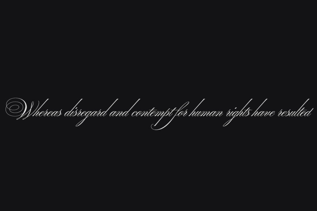
This font works particularly well for:
- Couple names
- Wedding titles
- Save-the-date cards
- Greeting cards
- Wedding logos
Because the letters have an expressive flow, Ballet is best used for larger text. For example, you could use it for the names of the bride and groom while keeping the supporting information in a simpler font.
The contrast helps the main text stand out without making the entire invitation difficult to read.
2. Birthstone
Birthstone offers a more expressive approach to wedding typography. Its decorative script character can give invitations a romantic and personal feeling.
It is especially useful when you want the couple’s names to become the main visual element of the invitation.
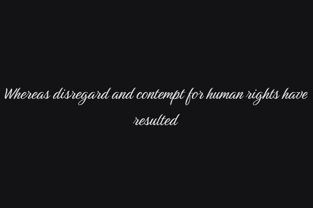
Try using Birthstone for:
- Bride and groom names
- Main invitation headings
- Monograms
- Wedding signage
- Thank-you cards
For a balanced layout, combine this type of decorative script with a clean serif or sans serif font for the smaller information.
The result can feel elegant without looking overly formal.
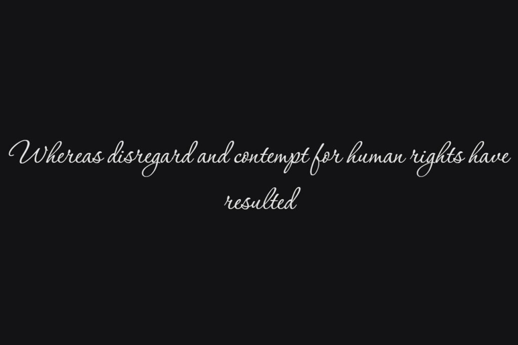
3. Corinthia
Corinthia is another beautiful option for couples who want a refined handwritten look. Its flowing strokes make it suitable for romantic wedding themes and delicate stationery.
The font can work well on invitations with floral illustrations, soft colors, or minimal layouts.
Then use a simpler typeface underneath for the date, location, and RSVP information. This approach gives the invitation a strong focal point while keeping the supporting information readable.
4. Fleur De Leah
Fleur De Leah brings a decorative and elegant character to wedding typography. It is a great choice when you want your invitation to feel luxurious and expressive. The style works particularly well for formal weddings, romantic celebrations, and vintage-inspired stationery.
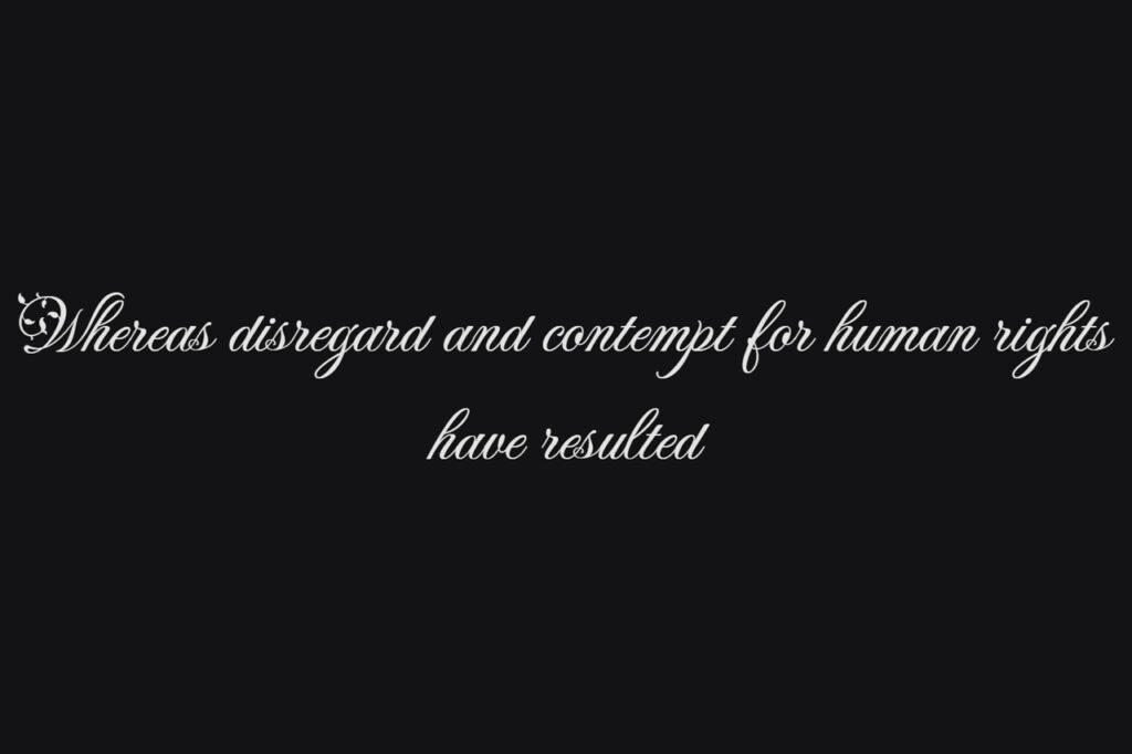
You can use Fleur De Leah for:
- Wedding names
- Invitation headings
- Monograms
- Wedding menus
- Place cards
However, decorative fonts should generally not be used for every piece of information. Instead, let the script act as an accent.
For example, use Fleur De Leah for the couple’s names and pair it with a simple serif font for the rest of the invitation.
5. Imperial Script
Imperial Script has a formal and elegant character that fits naturally into wedding stationery. Its flowing strokes make it particularly attractive for names and prominent headings. This makes Imperial Script one of the more versatile wedding fonts for invitations on this list.
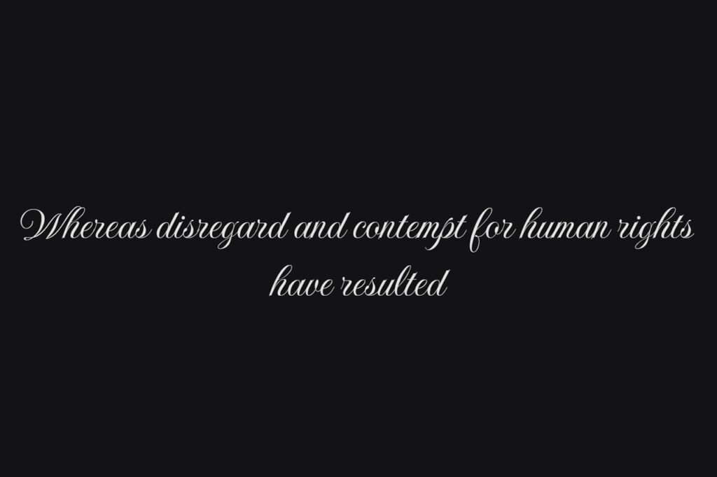
You can use it for:
- Couple names
- Wedding invitations
- Save-the-date designs
- Wedding programs
- Greeting cards
The formal appearance also works nicely with classic layouts. Pair it with generous spacing and a clean supporting typeface to create a sophisticated invitation.
If you want to explore more typography ideas, you can also browse Google Fonts for additional typefaces and inspiration.
6. Lavishly Yours
As the name suggests, Lavishly Yours has an expressive and romantic personality. It can bring a more relaxed yet elegant feeling to wedding stationery. This makes it especially suitable for modern weddings, outdoor celebrations, and invitations with a personal handwritten touch.
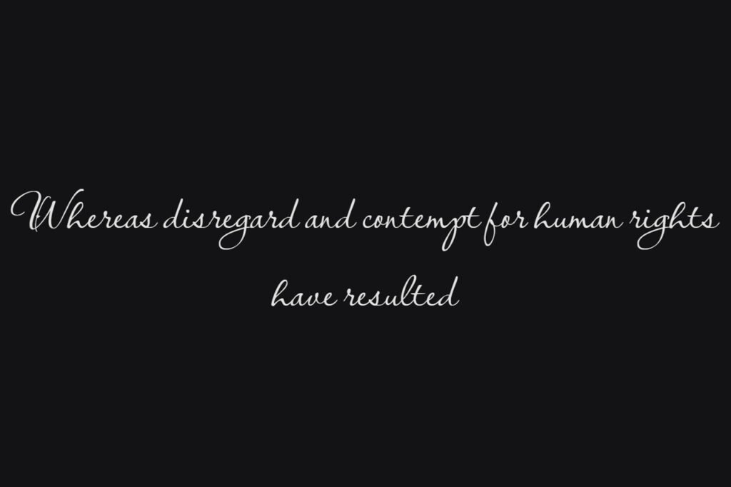
Lavishly Yours can be used for:
- Couple names
- Wedding headlines
- Quotes
- Thank-you cards
- Social media wedding graphics
For the best result, keep the decorative text short. A script font can become difficult to read when used in long paragraphs.
Therefore, use Lavishly Yours as an accent rather than the main font for every section.
7. Mea Culpa
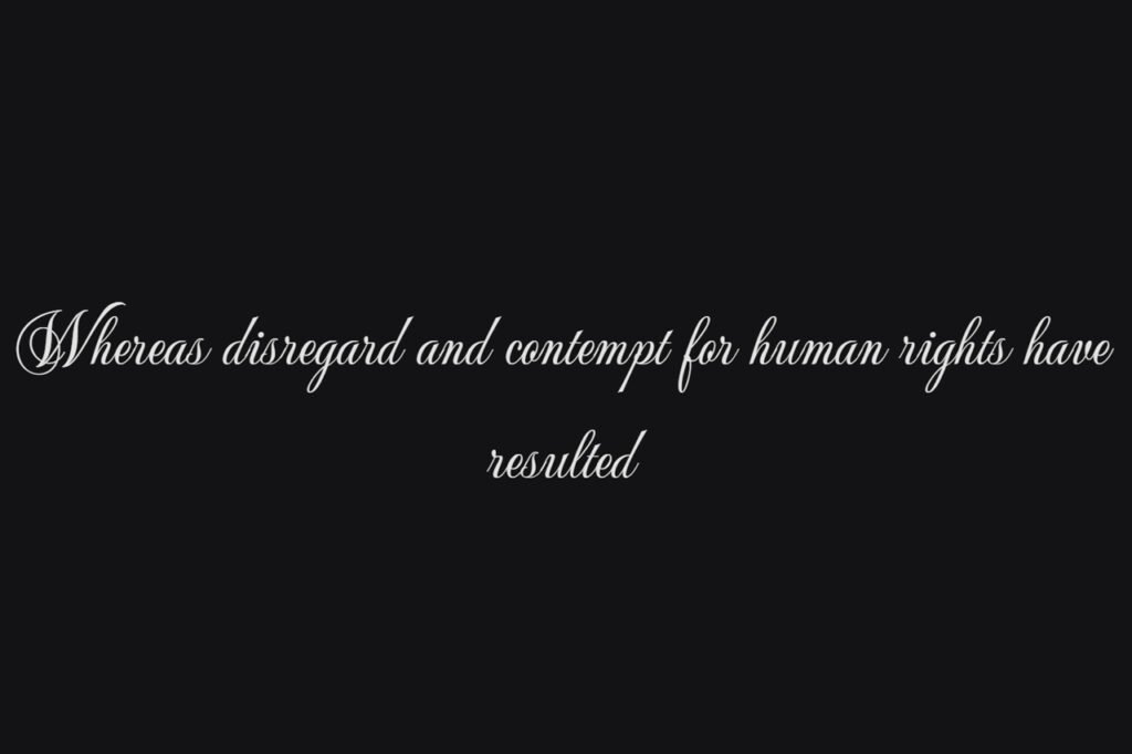
Mea Culpa is a graceful script font with a classic character. Its decorative letterforms make it a strong choice for formal wedding designs. The font works particularly well when you want the invitation to feel traditional but still visually expressive.
Consider using Mea Culpa for the couple’s names or the main wedding heading. Then, pair it with a simple serif font for the supporting information. This type of contrast creates a clear hierarchy between the decorative and informational parts of the design.
8. Monsieur La Doulaise
Monsieur La Doulaise has an elegant calligraphic appearance with a strong vintage personality. It can work beautifully for invitations inspired by classic European stationery or formal celebrations. Its decorative nature makes it most effective when used selectively.
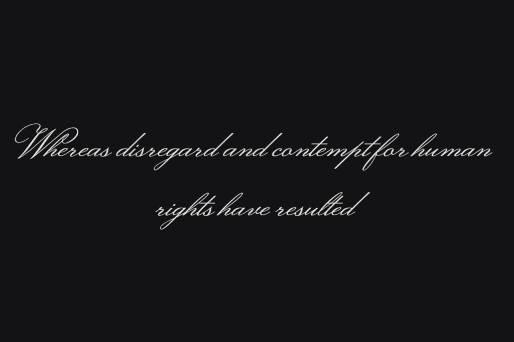
Try it for:
- Couple names
- Wedding titles
- Initials
- Monograms
- Decorative quotes
Because the font has a strong personality, you do not need many additional decorative elements. A simple layout can often make the typography stand out more effectively.
How to Pair Wedding Fonts for Invitations
Choosing one beautiful font is only half the job. The next step is finding a second typeface that complements it.
A simple approach is to combine a decorative script with a clean serif or sans serif font.
For example:
Script font: Couple names
Serif font: Wedding details
Sans serif: RSVP information
This creates contrast while keeping the invitation easy to scan.
Adobe’s font-pairing guide recommends using hierarchy and contrast while keeping readability in mind. It also suggests limiting the number of fonts used in a design so the result does not become visually chaotic.
Here are a few simple combinations you can try:
Script + Serif
This is one of the safest combinations for traditional wedding invitations. Use the script for names and the serif for supporting information. The result feels classic and sophisticated.
Script + Sans Serif
For a more modern wedding, combine a flowing script with a clean sans serif. The contrast between the two styles can make the invitation feel fresh and contemporary.
Two Different Script Fonts
This can work, but be careful. Two highly decorative fonts may compete with each other. If you use two scripts, choose one as the primary font and make the second one much more subtle.
Where to Use Wedding Fonts
The right font can be used throughout your wedding stationery, not just the main invitation.
For example, the same typography can appear on:
- Save-the-date cards
- Wedding menus
- Place cards
- Thank-you cards
- Wedding programs
- Seating charts
- Welcome signs
- Social media graphics
Using consistent typography across these materials can make the entire wedding design feel more cohesive.
However, you do not need to use the exact same font everywhere. You can keep one signature script for names and headings while using a simpler font for longer information.
Tips for Choosing Wedding Fonts for Invitations
Before finalizing your design, keep these tips in mind.
1. Prioritize readability
A beautiful font is not useful if your guests cannot easily read it.
Always check the font at the actual size you plan to use.
2. Use decorative fonts selectively
Script fonts are excellent for names and headings. However, long paragraphs are usually easier to read with a simpler typeface.
3. Match the wedding style
Think about the overall theme.
A formal wedding may suit an elegant calligraphy style. Meanwhile, a casual outdoor wedding may benefit from a softer handwritten font.
4. Create contrast
If your main font is highly decorative, choose a simpler font for the supporting text.
This helps establish hierarchy and keeps the invitation visually balanced.
5. Test the complete invitation
Do not judge a font from the font menu alone. Put it into your actual invitation layout.
Check the names, date, venue, and other details together. This will give you a much better idea of how the finished design will look.
Final Thoughts
The best wedding fonts for invitations should make your stationery feel special while keeping the important information easy to read.
Ballet, Birthstone, Corinthia, Fleur De Leah, Imperial Script, Lavishly Yours, Mea Culpa, and Monsieur La Doulaise each offer a different personality. Some feel formal and traditional, while others are softer, more romantic, or more expressive.
Ultimately, the best choice depends on your wedding theme and the mood you want to create.
If you want to experiment with typography beyond wedding stationery, you can also explore more font and design inspiration from Adobe’s typography guide. Adobe highlights the importance of readability, hierarchy, spacing, and appropriate font pairing when creating effective typography.
For more elegant script and display fonts, you can also explore the font collection on JadaType and find a style that fits your next creative project.
If you’re looking for something more playful and charming for your wedding-related designs, you can also explore this collection of free cute fonts for additional typography inspiration.
In short, choose a font that reflects your wedding, pair it with a readable typeface, and let the typography become part of the story.